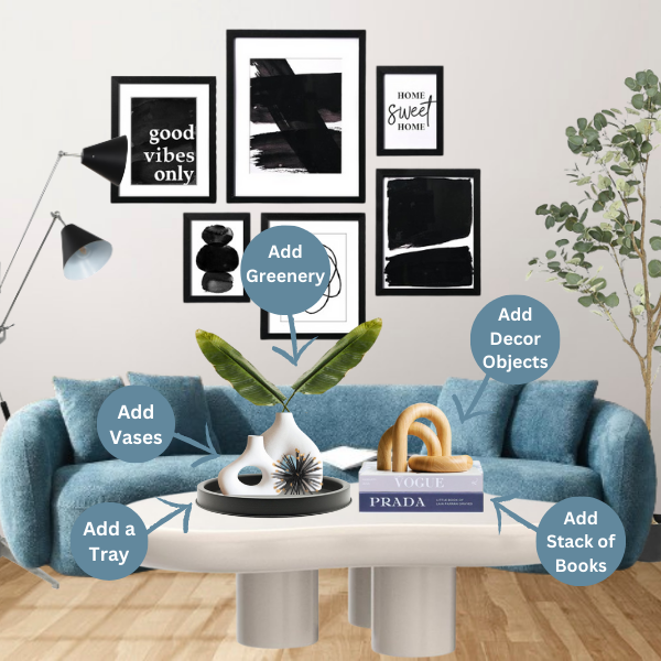
A home decor blog packed with fresh decor ideas & expert tips, buying guides, and more to spark creativity and guaranteed to make your home Instagram-worthy (and maybe a little bit envy-inducing).! ✨
Stop Wasting Money on Decor That Still Doesn’t Make Your Home Look Right…
Discover the 119 designer-approved styling rules that help transform ordinary spaces into polished, high-end homes—without hiring a designer or starting from scratch.
Hey there! Welcome to my happy place – a blog dedicated to all things home decor. Whether you’re an interior design aficionado with a Pinterest board full of inspiration or just starting out and feeling a little overwhelmed, you’ve come to the right spot.
I believe that creating a stylish and inviting home shouldn’t cost a fortune or require a design degree. I’ll dish out budget-friendly tips, easy DIY projects, and the latest design trends to help you transform your space into a reflection of your personality.
So, grab a cup of coffee (or your beverage of choice!), get comfy, and let’s get started on making your home the envy of your friends (but don’t worry, I won’t tell them your secrets!).
Join Other Decor Officionados, and Get Access To This Free eBook. The 12 SECRET STEPSInterior Designer Use To Decorate their Client’s Homes From Start To Finish. Fill Out The Form Below To Get Your FREE Copy.